
WHAT ARE THE DESIGNER DIARIES?
These are my ramblings as I make my way through a project. They are not edited or refined they are asa friend once called them BRAIN SPLATS, its what happens in my brain before its all layed out or pretty for an audience. I felt these entries would be valuable to other designers who struggle as i do with always wanting to put their best foot forward. To emppathise with the fact that design good design is not just a big magic button you can push that some people just have, there is alot of background work, learning and mistakes that goes into that great design you see on someone elses profile.
To all my fellow designers, i hope you gain something from reading about all my fumbles and tumbles.
Portfolio website (webseption)
PROJECT STATUS: on going
THE VIBE: UX, UI and design thinking
CLIENT: Me
This is my personal portfolio, it is a long and grueling thing and very hard to design for ones self, especially being me who likes to make thier life complicated before simplifying it down to managable, this project is why i started the designer diaries
Table of Contents
So this will eventually become a video, I want to talk through my designing process for my portfolio website rather than it feeling like a “webseption” layout. But this stream of consciousness article will be a nice accompaniment.
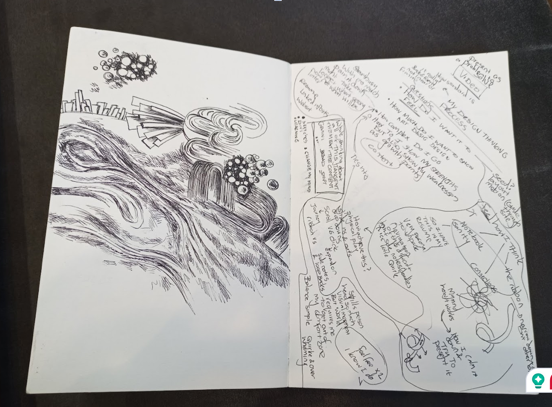
This is my innitial brain splat for the video and explaining my design process for this portfolio site.
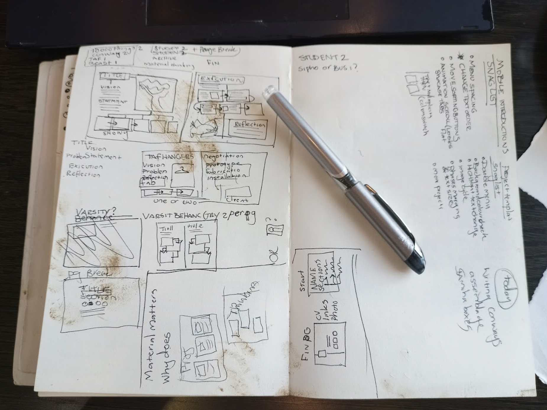
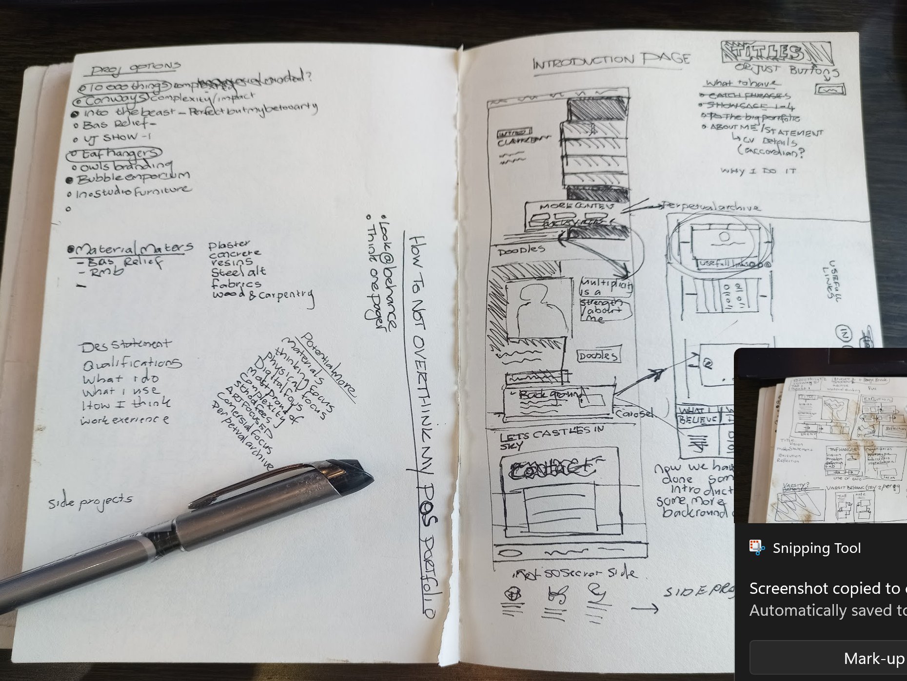
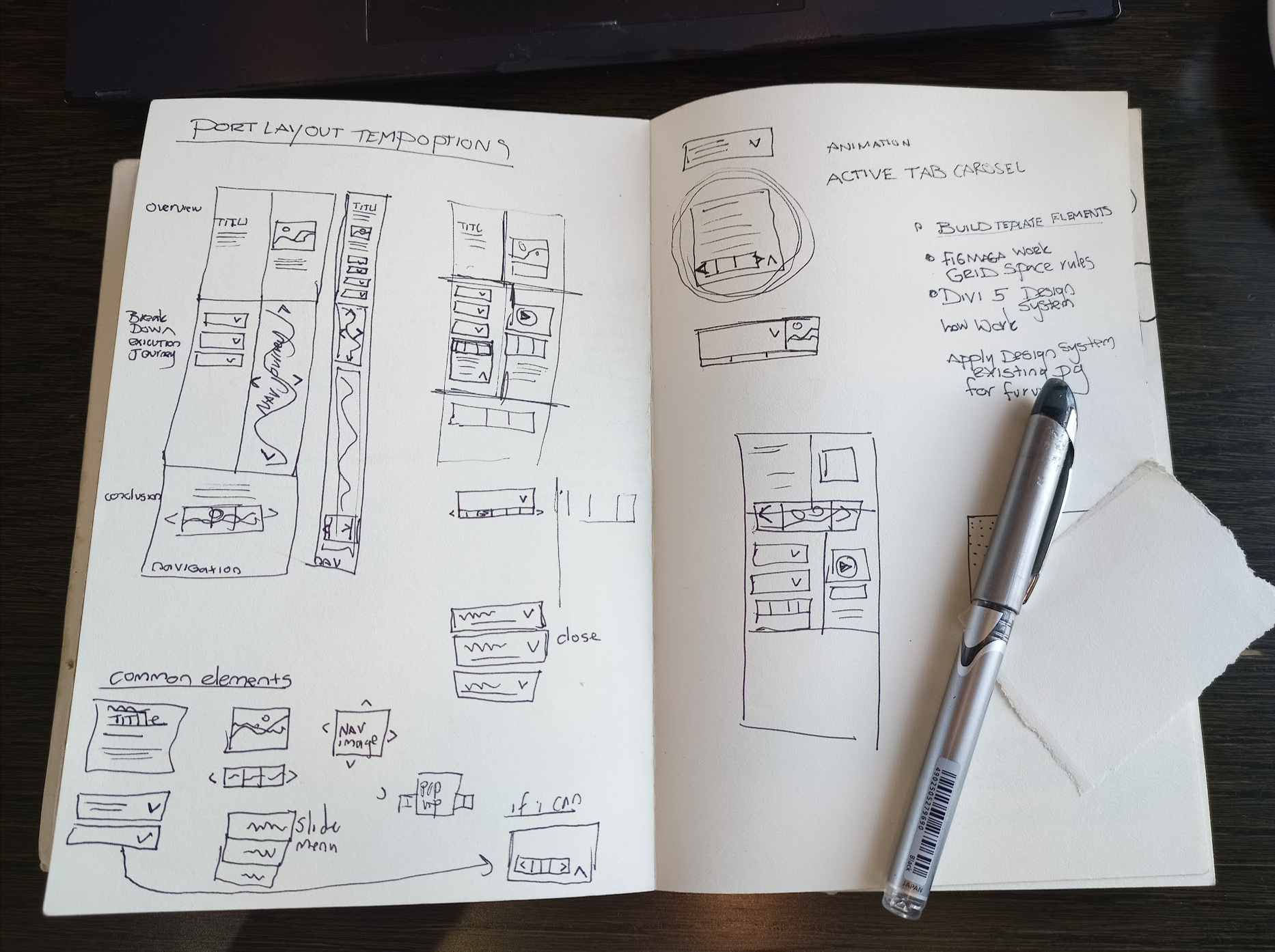
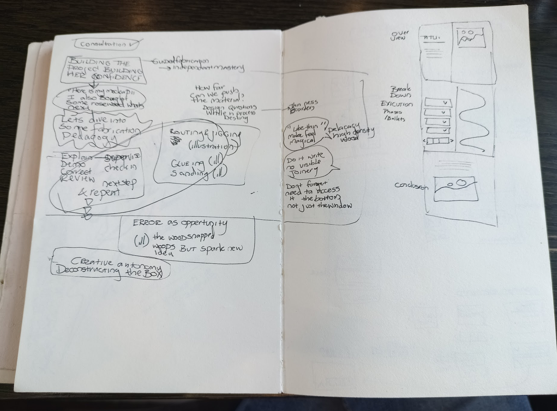
I wanted to work…organically? Not sure if that is the right word. But basically use it as an exercise to update my digital design skills and figure out how the leaps in technology and software will influence and shift my personal design process. Probably not the best approach considering i needed to get this site up and running FAST! But it was the approach i took.
I got really frustrated in DIVI as I was tweeking and playing around i kept loosing links and work, i think the new builder although amazing because of the similarities in logic to figma still has some bugs… so i switched back to figma and a static layout to try and iron and fix the tangle i called my design system. As well as play around with my home page layout again not that i was feeling a bit more comfortable with Divi and designing digital interactions again. Nothing harder than designing while your skills are feeling rusty, nothing moves the way you want it to, but a bit of oil in the joints and a bit of polishing makes it easier to get in gear… only problem is one then needs to sometimes go back and repeat steps.
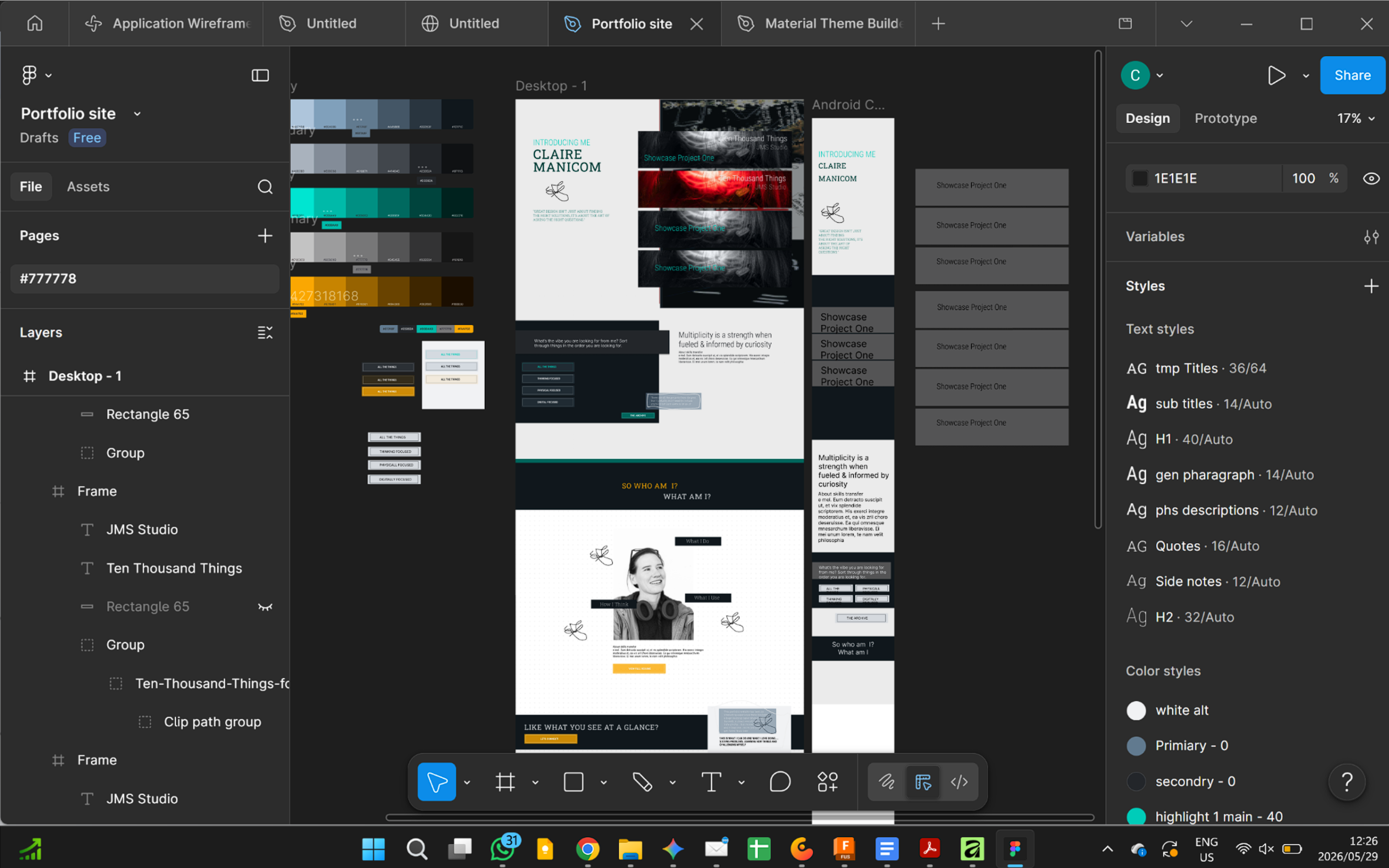
Before (still live in DIVI) and after redoing it in figma. Not i need to head back to divi and make all the changes… sigh… Im still more comfortable doing the interactions, effects and animations in DIVI so for now will do that… but will then go back into the figma design and neaten the naming and put in the interactions, for the practise and learning more than anything.
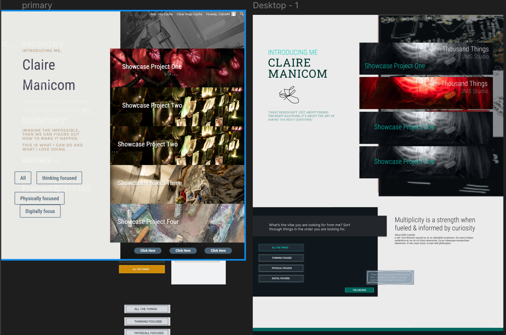
So… design systems are not a new thing, and they are not new to me in an informal sense. I have always used them informally because i have not worked often with a team of designers (usally im the sole designer) when i have had to formalise it i have always structured it more as part of the brand identity. Although it feels like im going backwards im formalising my intuitive “design system” to that it is more presentable and will hopefully help me clean things up on the visual backend (not code backend) for ease of future updating when i get board. And hopefully i dont decide to design from scratch again.
1 June
WHOOPS I BROKE IT
sigh ….
I did something that messed up the alignment of things, it looks great in the builder and preview but then go to the live site and its all messed up and has duplicated itself, the animations dont load properly, basically its a mess. I feel like i have tried everything, changing settings in the builder changing settings in wordpress and changing settings in cpanel, clearing caches safemodes duplications. I think the more i try the messier the backend gets and i am not a backend person, the most i can do is a bit of copy paste css… so what now?
Well i often think of a memory from when i was a kid, i was given one of those paper cocktail umbrellas to play with. I open and closed it, open close open close… eventually it would not stay open properly. I got so frustrated by this till the point where i decided to push it up all the way so that it completely broke!... perhaps a sign of some early OCD vibes, but i learnt something valuble that day about myself… when somethings not working the way i want it to i still keep going but not everything can be fixed, and sometimes the more you try to fix it the worse it gets… sometimes its better to find a new cocktail umbrella and be more reserved in how many times you open and close it.
So how does this lesson effect my web design… well i learnt alot from breaking it, so if i had to make it again it will be alot faster, probably neater on the backend hopefully.. Lots of lessons learnt in the designing process, frustrating but hopeful the “school fees” will be worth it in round two.
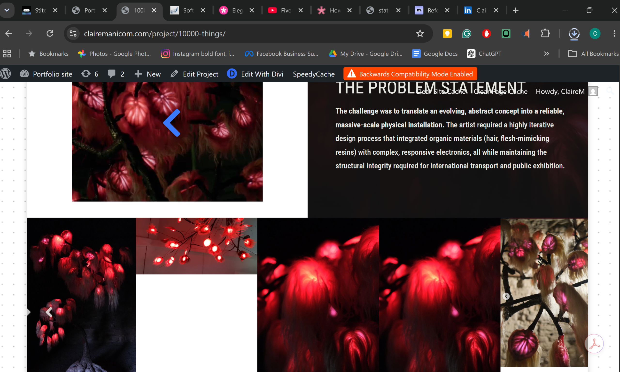
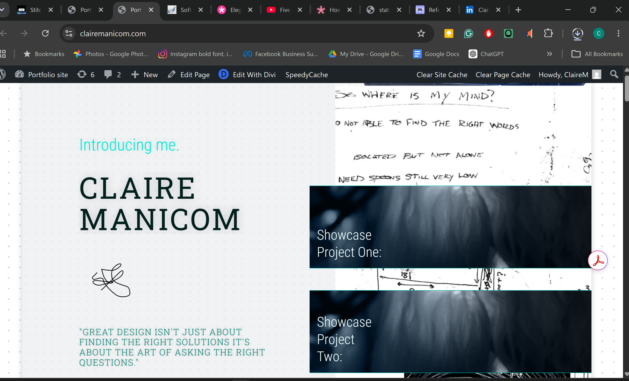
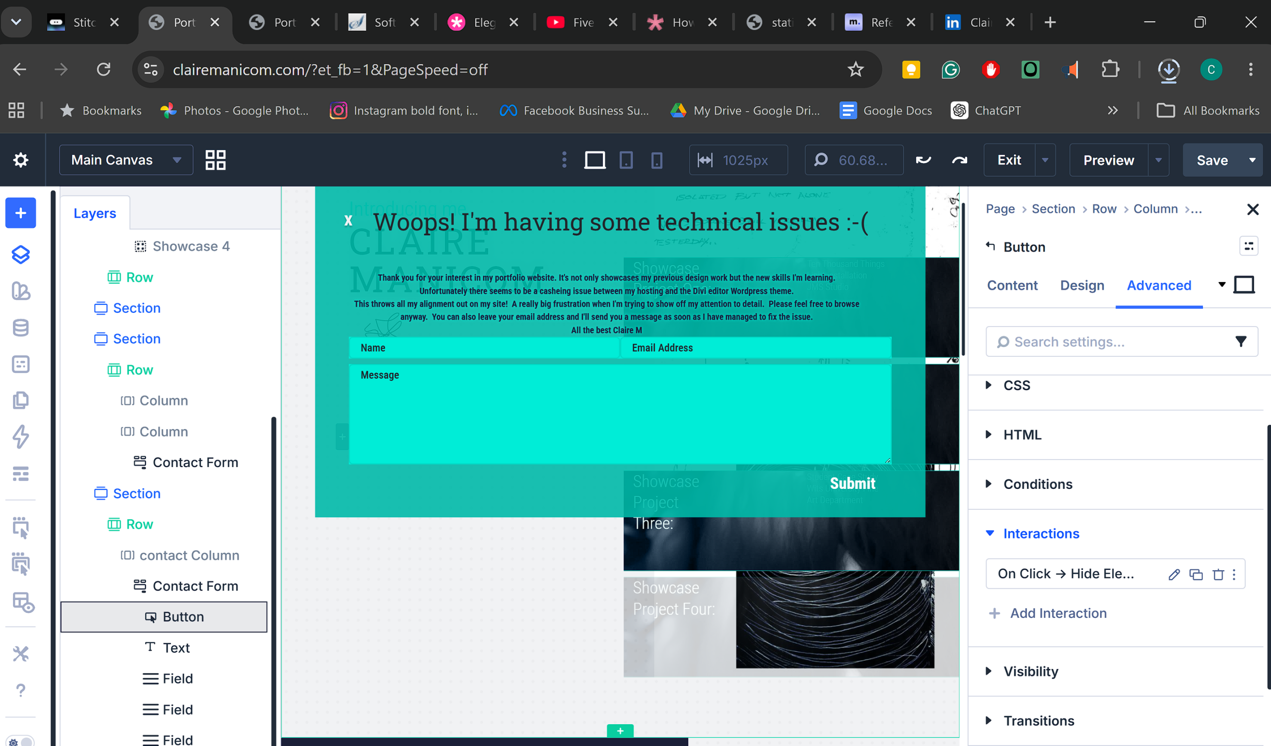
Ok so i did it i backed up the broken site in cpanel and cleared everything at cpanel level
…aaaand forgot to take some screen shots of the presets i wanted to keep…woops. Hopefully my memory is good enough if im really struggling ill spin up (think thats the right term) the old site on Local local server. I thought about saving some of them to the divi cloud which means i could access modules over any site or domain but i didnt want to import anything that would mess things up again.
3 June 2026
So far so good site is looking good over desktop, tablet an mobile. Im checking the layout between the 3 more frequently which i think is good professional practise.
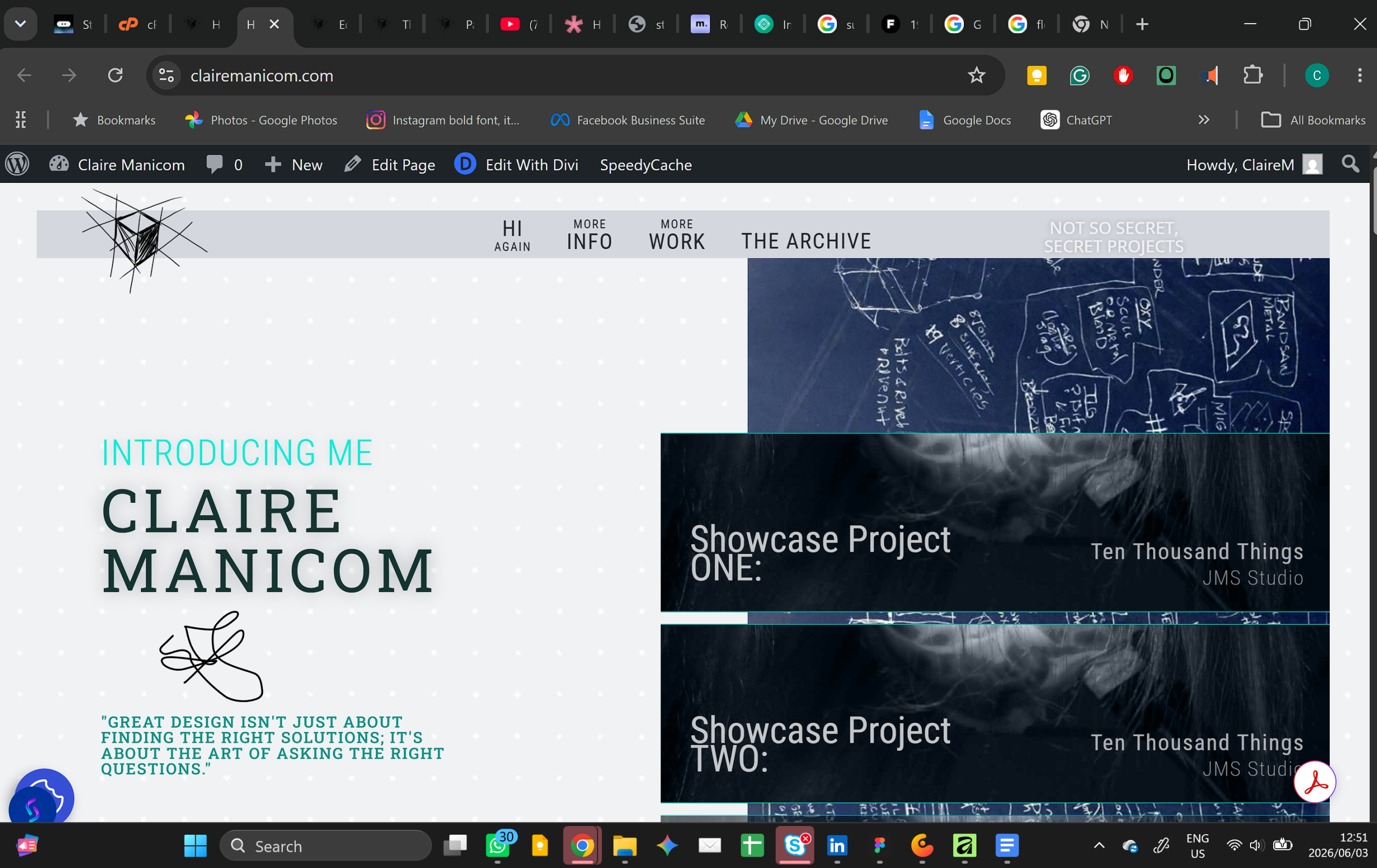
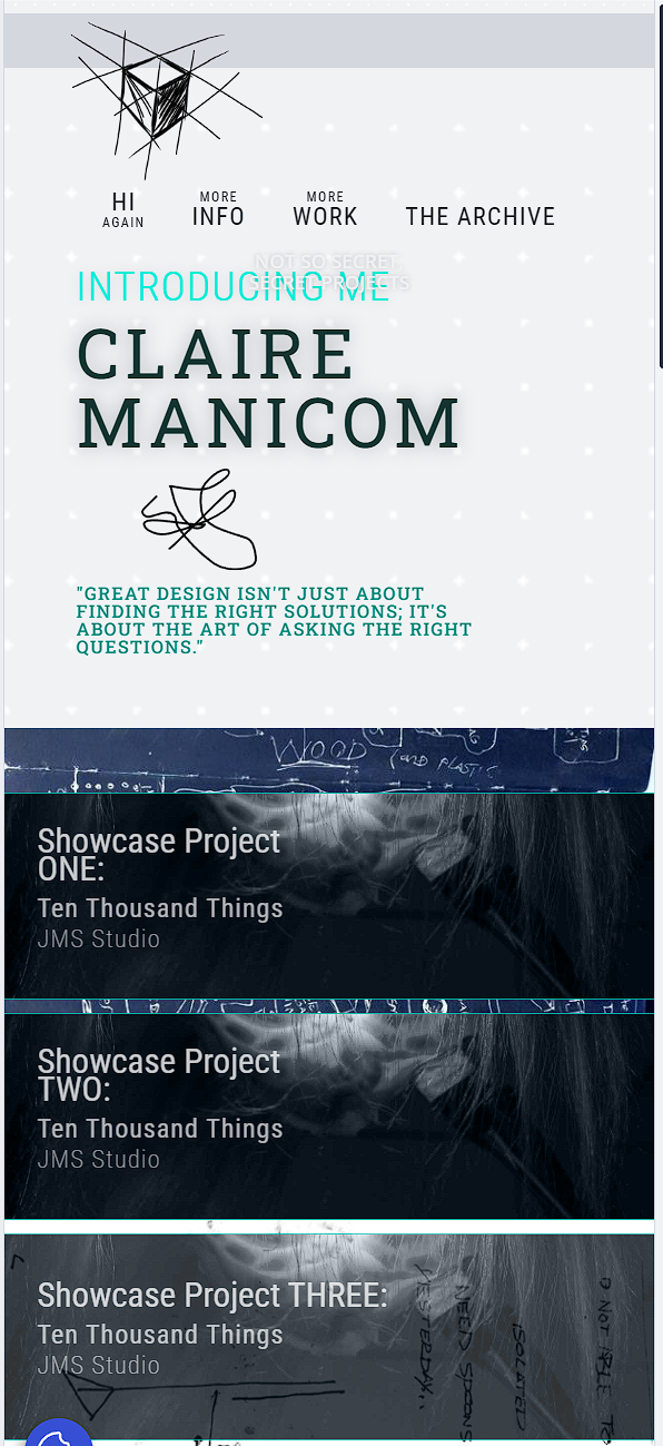
Ok the navigation bar still needs some work in tablet and phone mode but ill deal with that when i get to the footer.
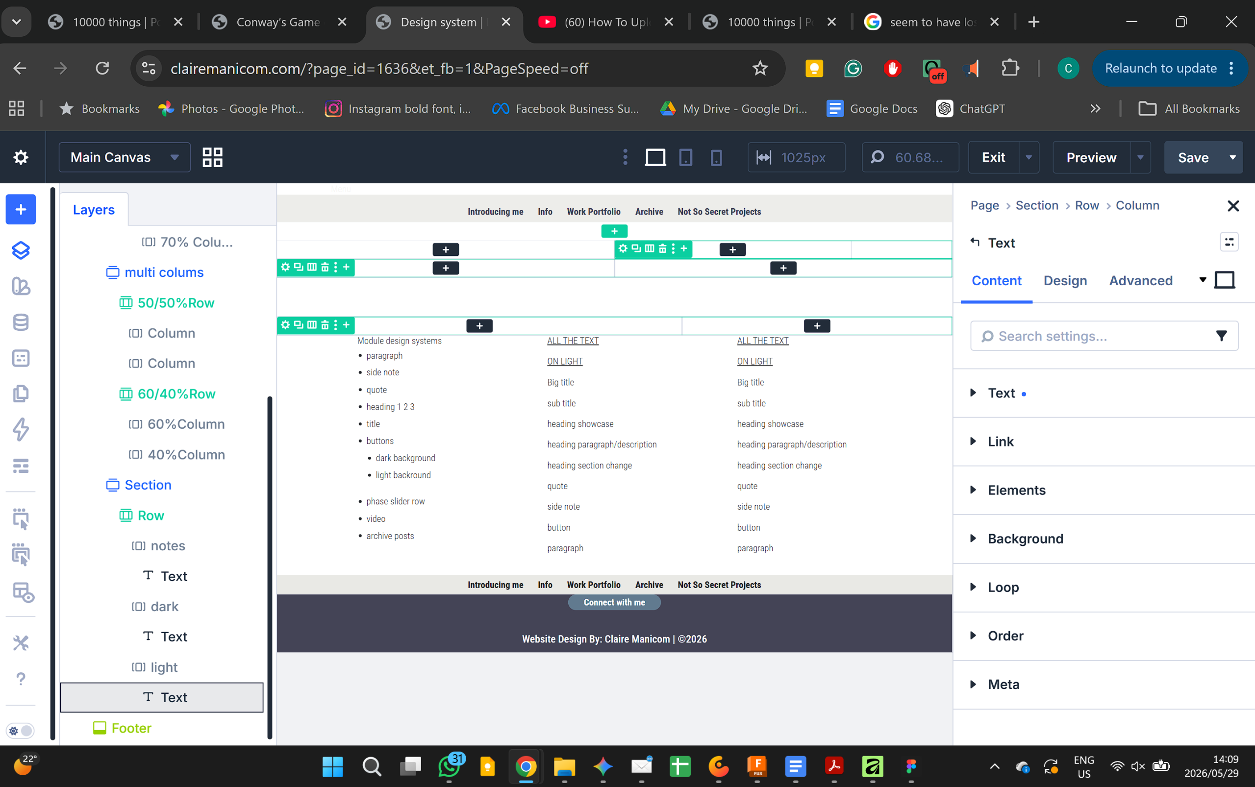
While messing up my previous version i mad a birds nest of the new preset system in divi(very similar to figmas logic system yay). So this time around because i know what i want its ALOT cleaner. I feel like i have figured out a personal workflow… hopefully i can use this personal workflow for future ux web projects
Look how pretty my layers section is lableled!
nd my design variables part of the design system are getting there too.
I now also get the difference between these variables and presets
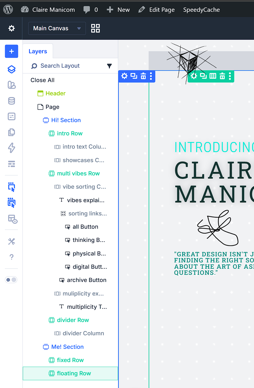
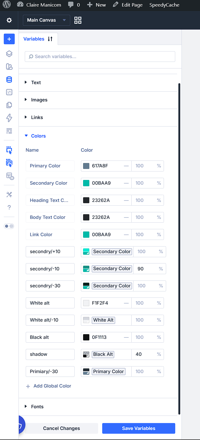
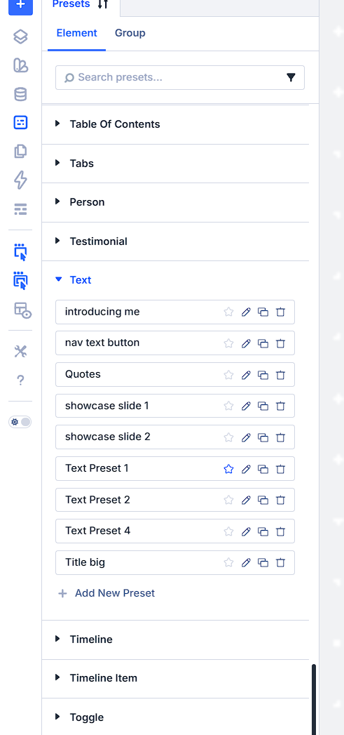
Things are still fairly static. Once everything is layed out then i will address my cheeky popups and scroll effect and gover effects, wich im excited about but will involve some playing around so think i will do it on a copy of the site and then when i have figured them out ill put it onto the live site.
Designers diaries, or mybe another name… i think it will be a good way to document and share documents like this one, un polished and not portfolio ready but still important, a behind the seens…
6 June 2026
I struggled yesterday to keep motivated about the fact im doing work all over again and feel like im loosing all the cool interaction pieces, but i know one i have finished laying down the foundations ill get the flashy bits back in place, the will be less likely to break, and i can fiddle with them without feeling guilty that nothing is up yet.
Links to exciting things coming soon are in and seem to be working, not looked at hover or click effects yet but that will come later.
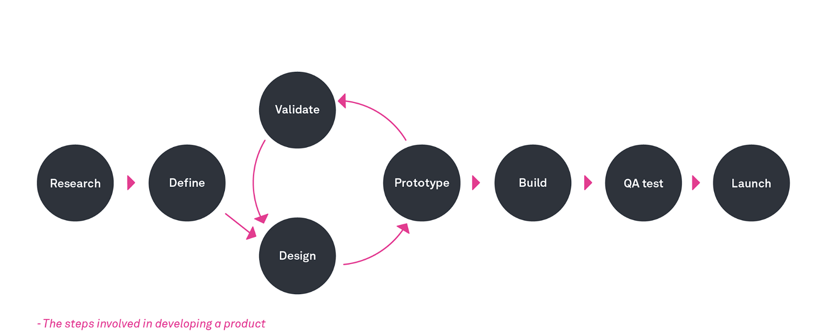
So we are taught to put content towards the end…
Empathise and research —- Define —--design, prototype, validate, test —-- CONTENT —- feedback cycle, —--- build —--test more—- launch
But im finding it easier to do content first, i guess i could argue that it is part of the research and define phase. I had most of the content played around with ways it would fit and layout in figma, then i copy and pase the content into the right columns and rows, only then do i start with the visual design work, fonts, colours, spacing, images, interactions. I guess this is working because its me im designing for its my story, i dont need to visually communicate to the client while they are figuring out the content because its in my own head and vision (by content i mean wording titles which images ect not content sections that would alway fit more into the define phase for me)
How and another naughty design rule im breaking is that this site is already live. This is so that i put pressure oon my self to GET IT DONE. rather than sand boxing it till its perfect.
Working on the project pages now, want to change the background grids colour butr have to tell meself that that is not part of my current GET IT DONE requirements…sigh.
Neither is the self typing text because i know ill get nitpicky about that… so static for now.
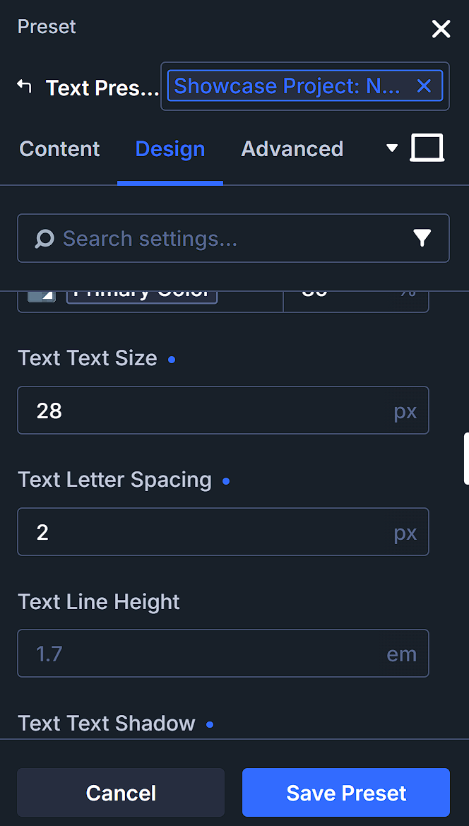
Really not sure if i should be as inconsistency with my spacing between letters… i think adjusting it is a good way to increase or decrease readability based on the priority you want it to be… I will have to come back to it abit later in the process and re look at it across all the pages. It will be an easy thing to update because im usin g the preset functionality.
8 June 2026
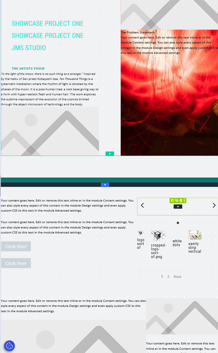
Ok getting there with layout of the project page,
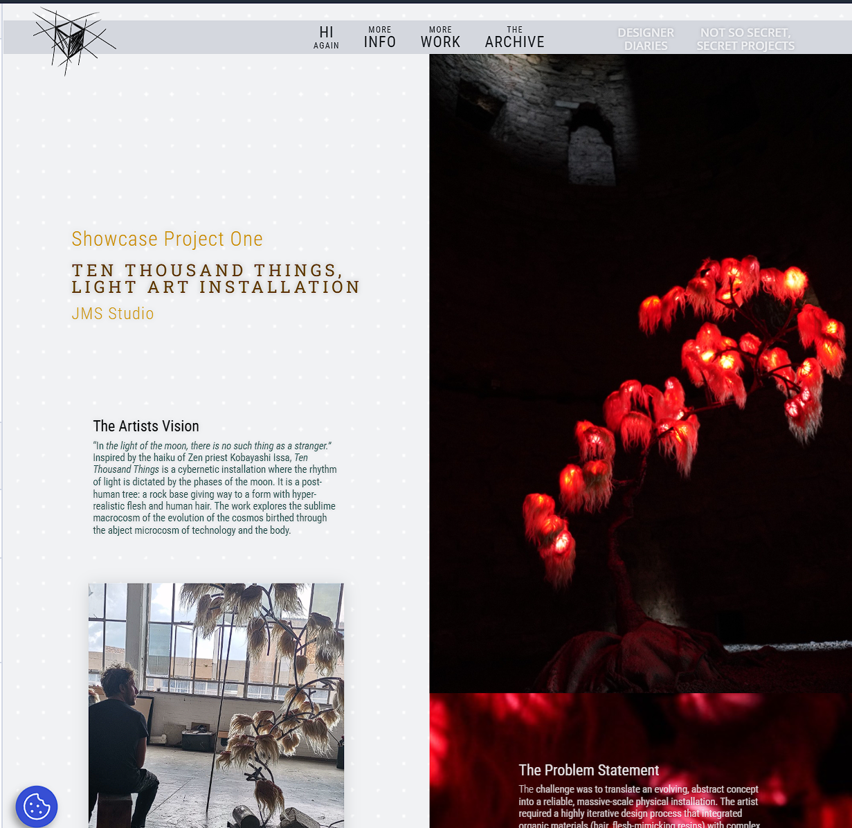
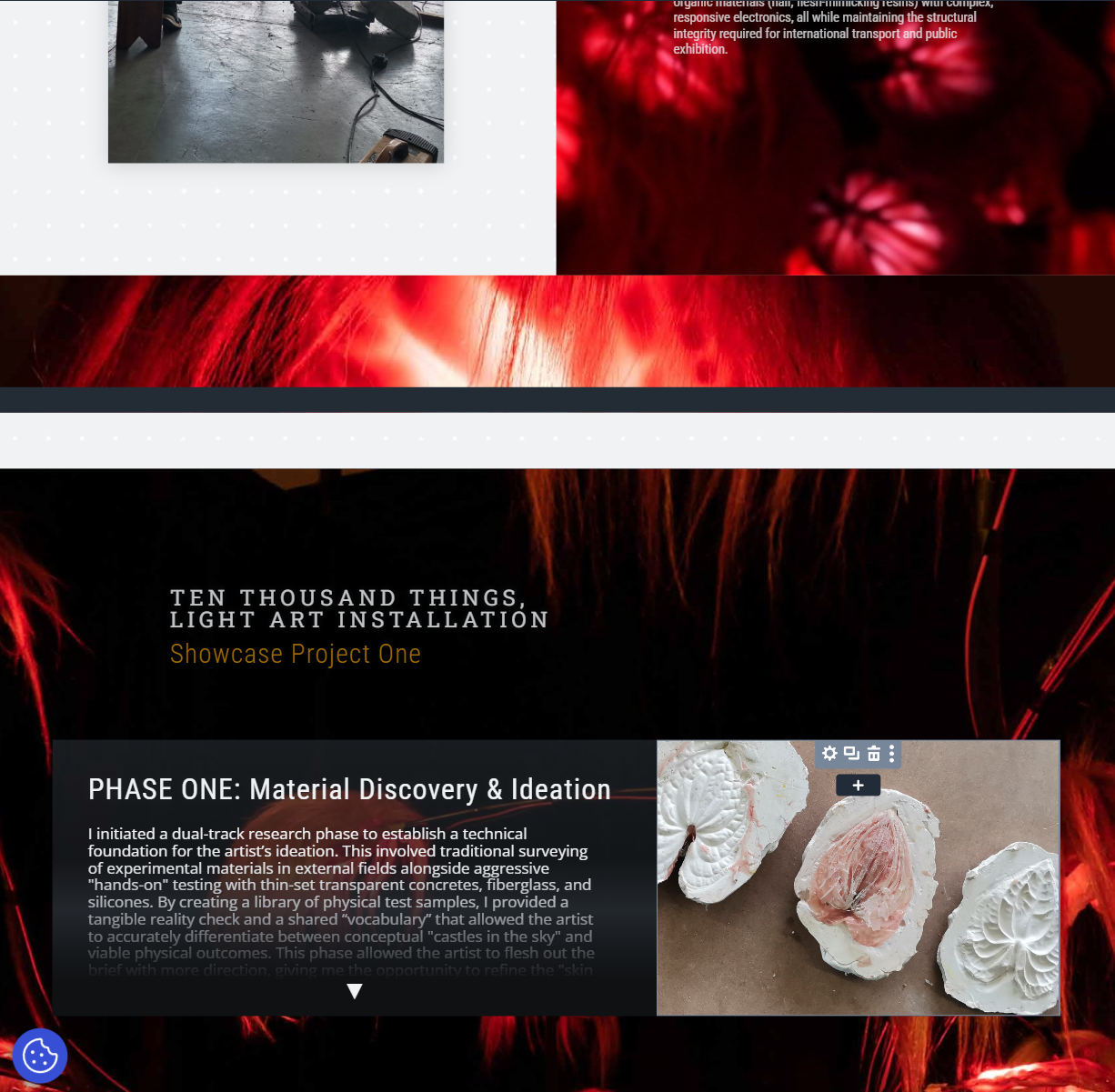
now to do the css attributing so that i can make the sections expand when clicking.
Tablet mode ooks good when minimised phone mode still needs some work… Rather than having a gallery of more images pop up (having the multiple canvases seemed to confuse the site. Im having it in line with the expanding text.
This will work for now…
Also not to self… font size is an issue on the phones i will have to adjust this.
Im debating if i should take a break from the project pages… these are important to get up properly but im feeling fatigued by them and nervous to get stuck on the expanding attribute function.
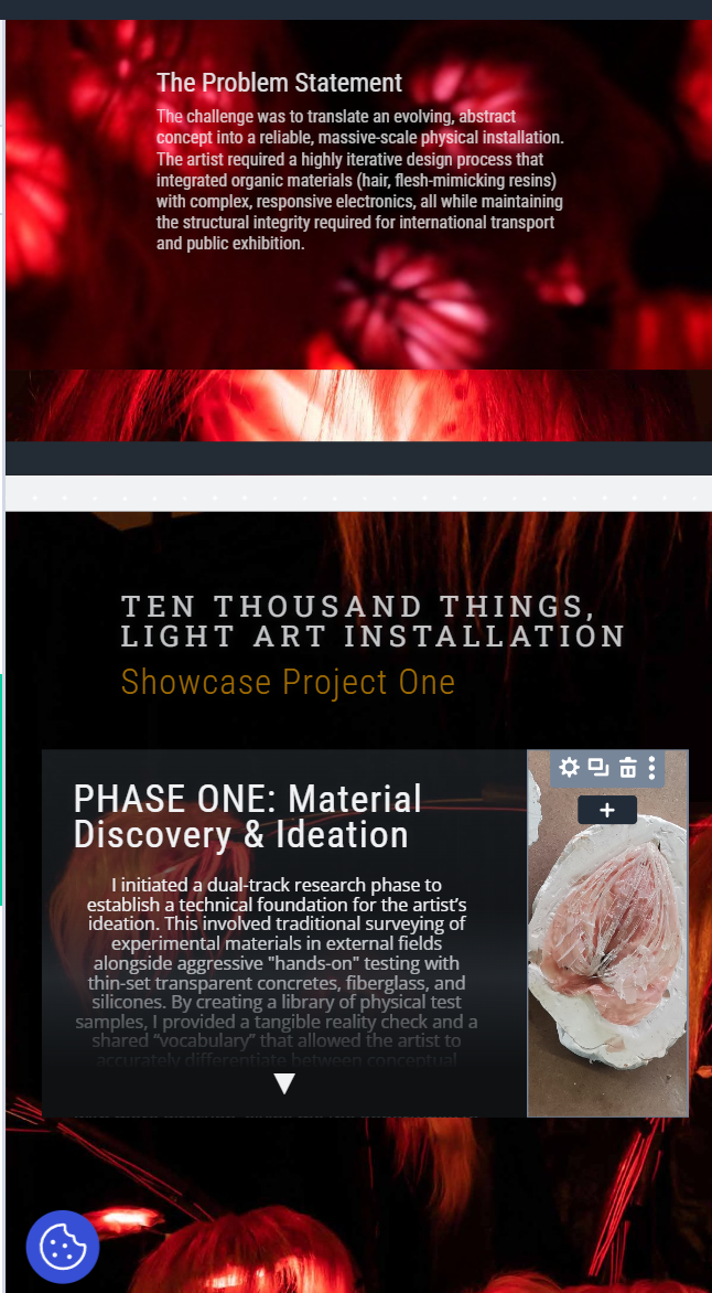
9 june 2026
Ok lets get fancy using some CSS and interaction settings (expanding sections)
I decided to set this up on a new page (mess around page) to help with loading times and that i would not throw any setting or alignments out by accident. Will also use this page to play around with the self typing text i want on the site so badly. Found some nice code for it which might be better than using a legacy module for loading times
Isolating the code with a code module for now will put it into the sites global css once im happy with the functionality
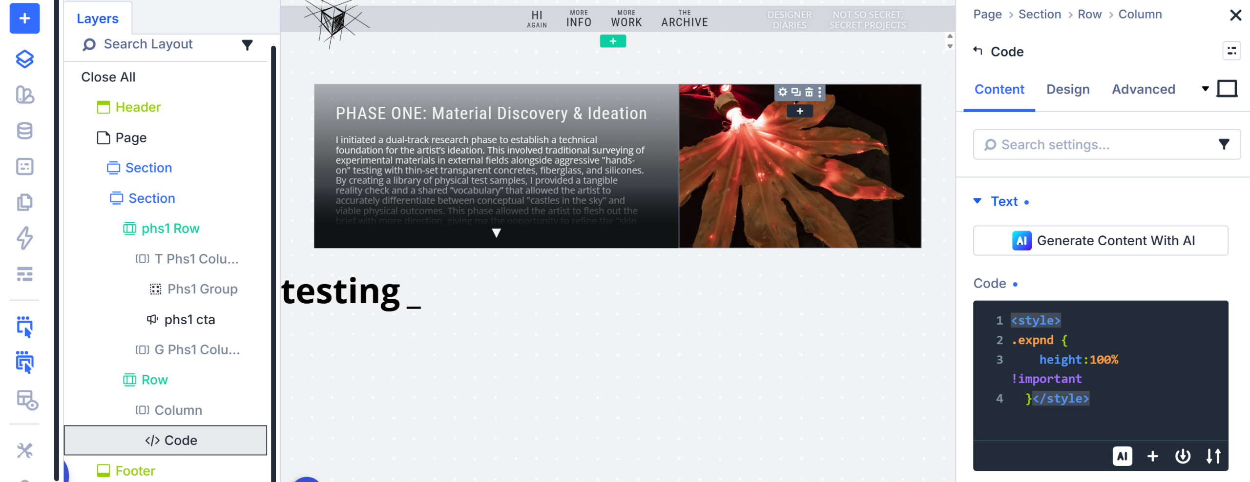
So far so good. Module expands
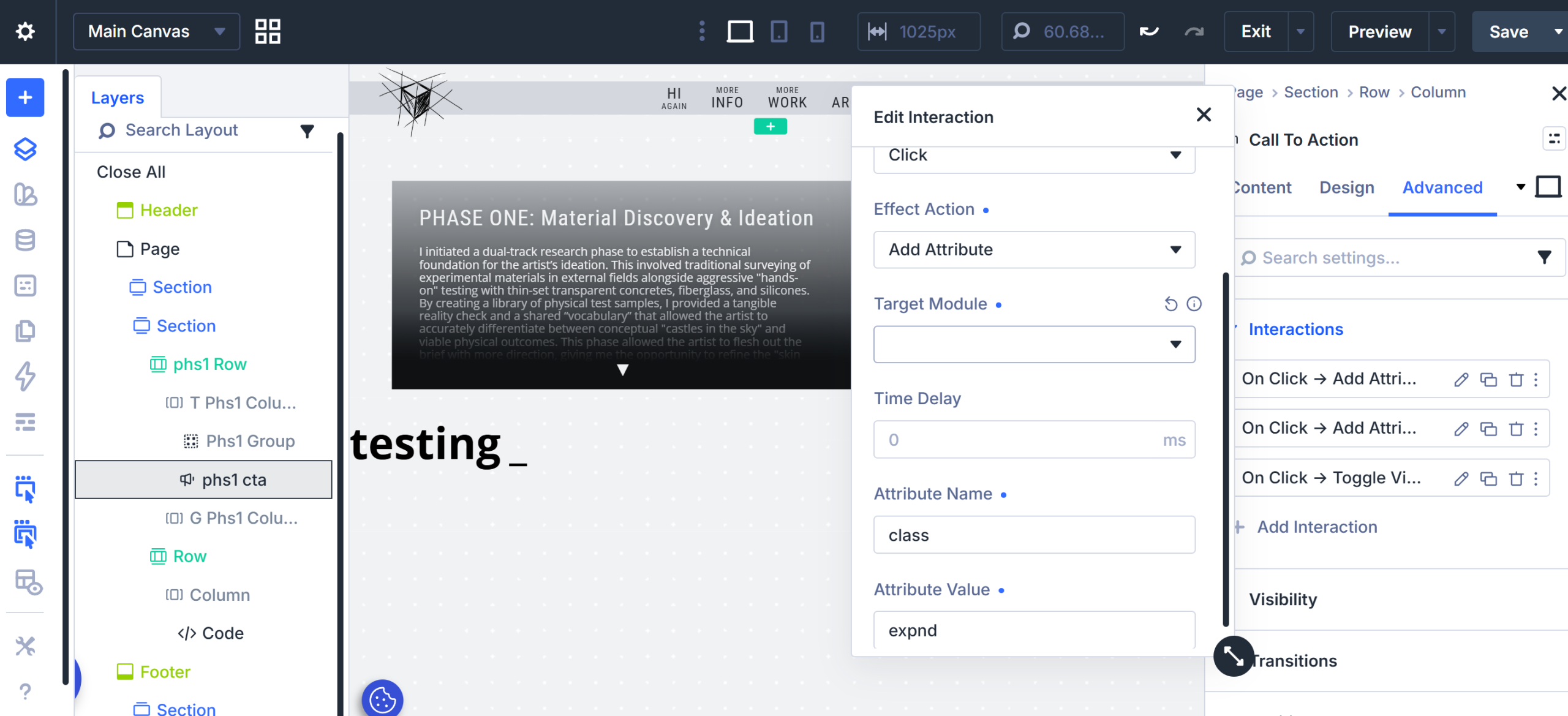
Close button does not work… dahm…
Helps if i assign the interaction. Ok it now works just does a wierd jumping glitch thingy
Stopped the glitchy but now not quite where i want the arrow to be… but thats ok. Weirdly throuwa the alignment out of the other arrow when minamising again but thats ok for not too
Yay found the issue it was a flex box align to bottom thin so changed it to a block layout and did it oldschool divi spacing seems to work ok on different screen sizes still
figured out what to do for the space bit… more sketch work but it will be nicely on them
….. And adding css to theme options….
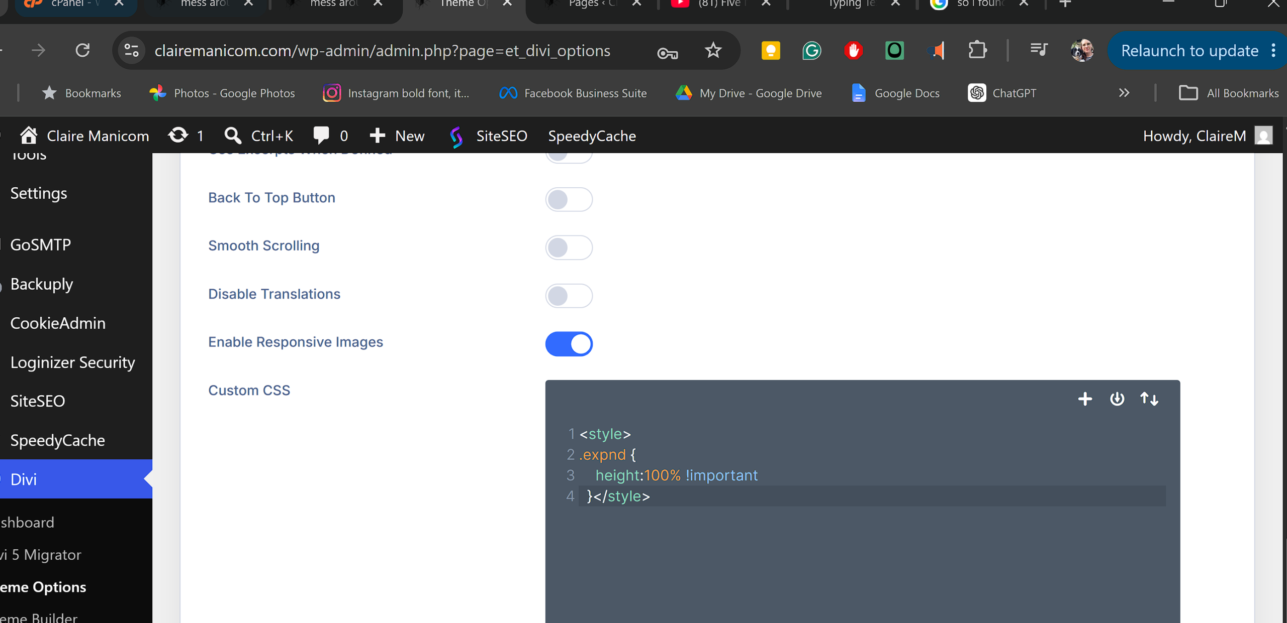
.... Still working? YES
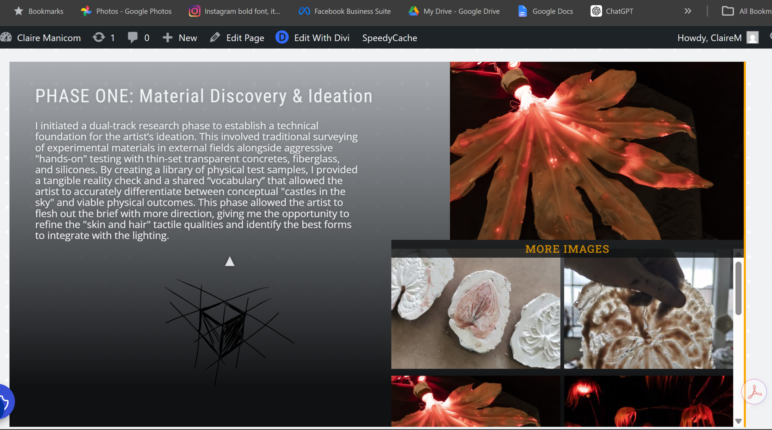
Lets put these elements into the live project page, yay! It works!!!!
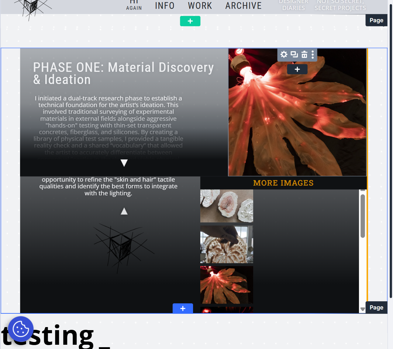
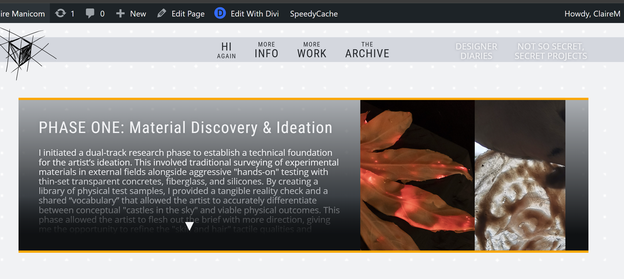
Nevamind messed up layouts for tablet and phone mode
10 July
so took a bit of a break after doing a big scary post on linked in. glad i did it but has made me feel very self consious which made it difficult to carry on. but I'm back, as i said in the article, its not about putting your best foot forward, just about putting a foot forward. and im playing into the imperfection vibe as much as i can at this point.
just finished copying and pasting text and images into this post. going to try recording things directly into this post rather than a word document. not sure if i will be able to flow aswell but lets see if it works it will save me time later.
going to upload the text and imagews for the other design diary posts while i work up the courage again to work on layout and functionality again. its so frustrating knowing what i want it to do and getting stuck on the nitty gritty bits of not being 100% fluid in the software. https://www.linkedin.com/posts/claire-manicom_im-not-losing-the-language-im-just-changing-activity-7422940444105465857-gSY2?utm_source=share&utm_medium=member_desktop&rcm=ACoAABOHihwBY92iWrGgQHSlRNJQ_f7JA82jvX4